Showing posts with label CTMH. Show all posts

Friday, June 6, 2014

FMS139 - congratulations

Hello! Happy Friday - glad the weekend is here! I so need to sleep in! Here is my take on this weeks Freshly Made Sketch!

Ok, I tried something a bit different when taking the photo of this card. I added some black cardstock behind to see if it would look better.  It does make the card stand out! pfft.

Stamps are from Close to my hear. I colored the flower with R83, R85, R89 and G24. The bow is made out of May Arts ribbon wire which I colored with the R83.

Tag die is from Papertrey, Ink as is the polka dots that are stamped in white onto the pink designer paper, which is from Fancy pants.

Have a creative weekend and thanks for stopping by!
Follow on Bloglovin

Saturday, April 12, 2014

FMS131 - May you have enough

Hi everyone! Well, I'm back from my week adventure (all business) in Alaska and I'm glad to be home. That dry cold is brutal to my skin - I can't stop iching!

Here is my take on this weeks Freshly Made Sketch.

It was kind of rough finding the mojo today and I'm still not real happy with how this turned out. But on to bigger and better things.

Stamps are from the CTMH set called Treasure Life. I used Memento markers to stamp the flowers. Green gingham paper is from A*Muse and the candy dots are from Studio Calico.

Green and yellow cardstock is from Bazzill.

Thanks for stopping by! I'm heading outside to enjoy the sunshine - glad to be able to enjoy the warmth!


Follow on Bloglovin

Monday, September 23, 2013

Wedding card

Hi everyone! Here's a recent card I did for a friend who just got married. It sort of follows the something old, something blue theme.


The sentiment panel is done using an old page from a book. I covered it with gesso and then used a die from PTI to cut it out. Flower stamp is from CTMH and colored with Copic markers.

Designer paper is from Making Memories. Flower is from OTC and I used the leaf die from Memory Box to go with the flower in the back ground. The double strand of pearls came from Michael's, which I've been hoarding for a bit.

Thanks for stopping by!
Follow on Bloglovin

Saturday, July 6, 2013

Thank you! CFC108

I everyone! I wanted to show you what I came up with for this weeks CAS-ual Friday's challenge.


I got the little draw string bag from Close To My Heart, it's muslin and comes in a package of 3. They're really cute! I stamped the sentiment from PTI using versafine ink then let it dry.

The sunflower is made out of sticky back canvas and colored with distress stains. I used the tattered floral die to cut out the canvas. I did not peel off the backing to the canvas because I didn't want it to lay totally flat. So, I decided to use hot glue to get it to adhere right.  Button is from American Crafts.

Thanks for stopping by!
Follow on Bloglovin

Saturday, March 30, 2013

Congratulations

Hi everyone! I got a chance to play with this weeks sketch over at Freshly Made Sketches. I've been in Alaska this past week freezing my caboose off and didn't think I'd have the energy today to make it happen! Glad I did! Here's the sketch.


The purple vellum is cut out with the butterfly die from Prickley Pear and I used their stamp set to stamp the antenna using archival jet black ink from Ranger. I used a tiny piece of foam tape in the butterflies center to attached it to the white circle. To hide it, I added some purple rhinestones. The sentiment is from CTMH.

The cardstock is winter wisteria from PTI and the designer paper is from Paper Wishes. I've had that striped ribbon in my stash forever and finally got to use some with this card!

Thanks for stopping by!

Tuesday, March 12, 2013

Red rose


Hi everyone! I can't believe it's Wednesday already - time is really flying by this week! Here's a simple birthday card that I cased off of Pinterest.


Rose is from CTMH and colored with Copics. I used a yellow stardust pen to highlight the stamen's in the center of the flower. I also did a bit of fussy cutting and then popped this one up using foam tape.

Sentiment is from PTI. The white, pure poppy cardstock and polka dot dp is also from Papertrey, Ink. Spellbinders circle nesties used to create the cut out.

Have a great week and thanks for stopping in!


Monday, March 4, 2013

Spring?

Hi everyone! The sun is shining here and looking a lot like Spring, however it sure is cold out with that wind blowing! Thought I'd post a happy spring card today using an old TAC set.


I stamped the daisy in canary ink from Colorbox and the leaf stem in Studio G chalk ink. I used the same green chalk ink on the left side polka dots, as well. 

Sentiment is made up from the CTMH stamp set card word puzzle found here (page 101) and then cut out using the fishtail die from MFT. I decided to layer it in black cardstock so that it would stand out a bit! Green cardstock is from Bazzill. The white card base and the black cs are from PTI.

Thanks for stopping by!

Thursday, February 28, 2013

CAS anniversary card

Hi everyone! Can you believe it's March already? I'm showcasing another CTMH stamp today with a CAS layout.


This one is from the Card word puzzle set. Sentiment is from Papertrey, Ink.

I colored the flower using R83, 85 and 89 Copic's. I used a circle nestie to cut it out and then popped it up with foam tape onto the doily, which is a PTI die.

Memory box border die used on the hot pink cardstock from Hot Off The Press. Lastly, I added some white satin ribbon for some bling!

Thanks for stopping by!


Monday, February 25, 2013

Doggone good day

Hi everyone! I was looking around at the CTMH web site recently and this guy jumped into my cart! He was panting, yipping and jumping all around because he was so excited to be shipped off to me! (giggle)


I used Prisma Color pencils and blended with OMS to create this darling dog! I haven't used this coloring technique in a while and it was fun to play around with it again!

Gingham designer paper is from A*Muse and cut using the fish tail dies from My Favorite Things. I stamped the sentiment and then used a smaller die to cut that out.

I cut the bow out of red cardstock to match his collar! Die is also from MFT. Black and white cardstock is from PTI.

What do you think  - doesn't this make a great masculine birthday card?

Thanks for stopping by!

Tuesday, September 8, 2009

Card Sketch Tuesday #145

Happy Tuesday! Here is sketch #145 ans measures the normal A2 size.

The panels measurements are as follows: Main stamped panel is 2.25 x 5, secondary right panel is 2 x 4.25. All are layered at 1/16th of an inch.

I'm still into my fall color palette and keep coming back to this english rose and olive green.


The flower is done with Marvy Markers in English rose and olive green. After coloring directly on the stamp, I spritzed it with water and then stamped it.

I used one of my nesties labels to stamp the sentiment and sponged the edges with Memento Bamboo Leaves ink. I added a small bit of ribbon on the left side just for grins and giggles. Two self adhesive gold pearls are put in the top and bottom corners on the rigth hand panel.

At the last minute, I decided to add the lacey border on the right side of the main panel. I'm not real sure that I like it, what do you think?


Supplies:
Stamps - CTMH
Marvy Le Plume II markers
Palette True Black ink
White, Olive and Burgandy card stock
Olive grosgrain ribbon
Gold pearls
EK Success border punch

Friday, April 11, 2008

Card Sketch #62 - Legal size


Ok...doing something a bit different on this one! Let's make it long - legal sized or 3 3/4 x 8 1/2, which is just a little shorter than a legal envelope.


The picture is too dark to actually see the dark purple card stock that was used to layer the panels. The main panel measures 3 1/4 x 4 and the two side panels measure 1 1/4 x 2 3/4 without the purple layers.

I used my Copic markers to color the main panel. The bottom right panel is done with Palette Muted Violet chalk ink, stamped off once, which matched the main panel just perfectly!

I couldn't decide what to put in the middle of the panels...it was too much white space for me and thought it needed something! I played around with some ribbon...didn't work. In the end I used some purple brads that matched the background card stock.

I added some crystals to the center of the flowers and then used the stardust gel pen for highlighting the smaller flower centers.

The weather here is just gorgeous today...sun is out, I see blue skies! Hopefully this bodes well for a wonderful weekend....time for spring - out with the rain and in with the sun! But you never know here in the Northwest....wait a few minutes and it'll change! Have a great weekend, everyone!

Supplies:
Stamps - CTMH Friendship blessings
Ink - Palette Noir and Muted Violet Chalk
Copic Colors - bv00 (Mauve Shadow) bv02 (Prune) and YG67 (Moss)
outlined in c1 (cool gray)
Purple Card stock - Bazzill
Purple Brads
Crystals


Sunday, March 16, 2008

SBS1 - Whatever Challenge

Summer - That's the theme! Time for relaxing and having fun at picnics, BBQ's, Camping, etc. I chose to make a card with a picnic theme.


The picture turned out a little blurry, but IRL this is a fun card

Supplies:
Checker board stamp from See D's
Watermelon stamps - Large TAC, small CTMH
Ant - rubber stampede
Dragonfly - TAC
Snap stamps for the sentiment
Blue and red cardstock - Bazzill
Light green paper ????
Colored with Copic Ciao's
Blue gingham ribbon


Wednesday, September 26, 2007

Card Sketch #23


Here is my latest sketch card. I've tried to mix up the sizes of my sketches to keep things interesting. This one as you can see, is square.

The card base is dark grey from Bazzill Basic's and the designer paper is from DCWV from their travel stack. I used some peel off's of leaves for the corners, stamped the left corner leaf (CTMH) with versamark and embossed with gold. The leaves in the bottom panel are stamped with Palette burnt umber and are from SU. The sentiment and the swirl are from The Angel Company, also stamped in Palette burnt umber. I thought the DP matched well with a lighter shade of grey from Bazzill, also. Since fall is upon us, I thought the pink tones in the DP reminded me of the shades of leaves as they start to turn color.


Well, I made it to Archivers and spent way too much money. I just love that store, so much to look at and choose from. I hope that one day they make it up to the Northwest. I also drove by a Hobby Lobby (we don't have these, either) and had to brake real hard to turn in. LOL...wow, is that a great store, too. I resisted spending money there, even though all of the paper was 50% off. I just didn't think that it would be able to fit in my suitcase for the trip home. You know those weight restrictions, and if I had bought all the paper that I wanted to, I would've tipped the scales. LOL...

Well, let me know what you think about this latest card sketch. I appreciate any and all comments!

Thursday, September 6, 2007

Card Sketch #18


Wow, what a week so far! I have spent the last three days working my caboose off. Nothing like working 40 hours in three days! Glad I designed this sketch and made the card last weekend, because I sure don't have the energy to do anything with it right now!

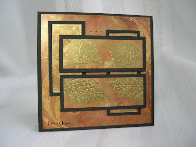
This is one of my favorites so far! I just love how it turned out as I was playing with my alcohol inks! It's so metalic and fall looking!

I used caramel, ginger, latte and gold alcohol inks to color the panels and toned it down with the blending solution on glossy white card stock. I then stamped my image in versamark and embossed them with fine gold ep. I also embossed the edges of the two vertical background panels. The background 4x4 piece was stamped with versamark and embossed with clear ep (stamp is flourishes from TAC), and then I used the alcohol inks to color the whole panel. I matted it with black card stock and then added the paper piercing to the finished product.

Stamps used: TAC flourishes and CTMH Autumn Splendor

I would love to hear any comments you have on this one! TIA !

Wednesday, August 22, 2007

Card Sketch #13


This sketch came about by accident as I was trying to do something totally different. Previously, I've been drawing them up on Microsoft word and then making the cards, this one I did in reverse. I was actually trying to case a card I had seen somewhere but didn't save, and my memory failed me. :-)

I've been playing around with Alcohol inks and came up with a really cool combination that is metallic copper and looks very Autumn-ish. In comes my new set of CTMH stamps from Rachel Shirk I got from a pay it forward thread over on SCS, called Autumn Splendor.

The green background panel is embossed using versamark and clear EP. I used colorbox chalk inks in warm red and yellow ocher and Palette jardin moss for the leaves on the copper panels. I also paper pierced around the perimeter and added some black brads at the top and tied a olive green ribbon around the middle panel.