It went something like this (pretend you're reading my mind):
*I like this flower stamp, lets color it with Copic's. Didn't like the look of it, shading is terrible in these pinks. Threw that flower in the recycle bin.
*Let's see, how about stamping the flower in white on red cardstock? That turned out a bit dull. How about embossing it with white embossing powder. Ok, that looks good. Where's all my red designer paper? (That started a search and destroy mission through all the paper - nothing was working with that shade of red cardstock.) UGH!
*Wow, I like this blue paper. I know, let me re-stamp the flower in blue. Shoot (or insert your favorite expletive) the blue ink doesn't go with the blue designer paper! Again another expletive!
*What about that other designer paper? Yes, now we're getting somewhere! But it doesn't really go with the flower now. Hmmm, the paper has hearts in it! I know just the stamp I want to use! Where is that stamp set? Darn it, where is that set? Oh, what's this? I like this one even better!
*Oh, and I know just the embellishments to go along with this blue now! Cool! Yes, finally done!
Whew that only took two hours. How do I know? I came up stairs to the craft room at 8 and had to be back downstairs at 10 to watch the new episode of Castle! =)
So, here is the final result!
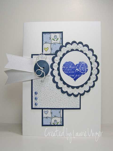 Heart stamp is a retired GWP stamp from The Angel Company. Stamped in Midnight ink from Colorbox and embossed with clear embossing powder.
Designer paper is from Hot Off The Press. Navy cardstock from DCWV. The lacy doily like layer behind the heart was done with self adhesive Vellum (left the adhesive on) that was ran through the Textile embossing folder after being cut out with a scalloped circle.
White grosgrain ribbon is layered on using foam tape and a blue button from American Crafts is attached with some white scrappers floss. The blue pearls are from Kaisercraft.
So, have you ever had one of these experiences making a card or project? I have them all the time! Sometimes what you have pictured in your head just doesn't make it onto the final project for whatever reason! However, during this two hour adventure I had a lot of fun (and frustrations for being such a perfectionist) and now have a few flowers pre-stamped for use on another card!
Have a creative day!


 This stamp is from Great Impressions and is colored with Prismacolor pencils and blended with OMS. The sentiment is from Papertrey Ink. The new snowflake embossing folder from Provo Craft was used on the base of this card. The snowflake stamp around the scallops is from Stamps by Judith and done with craft white ink. The tag is cut from Spellbinders nestabilities!
 This is probably my oldest snowman stamp! It's from Hampton Arts and is colored with prismacolor pencils and blended with OMS. The sentiment is from PTI and the designer paper are from K&Company. Deckled nesties were used to cut out the main image and the dark red layer.
 This stamp is from Great Impressions and it's acutally a square of 3 snowman plus the sentiment. It's stamped in Memories black dye ink and then embossed with clear embossing powder. I used glaze gel pens to color his nose and accessories! Pure poppy card stock was scored twice on each end, then I cut the snowmen apart and popped them up using foam tape. The snowflakes are from Provo Craft and cut out with the CB. I added a bit of Vanilla Shimmer spray from Smooch to them, but it's hard to see in the photo.

 It took me longer to figure out what to do with the corner pieces than it did to color the image! LOL! Stamp is from Great Impressions and colored with Copic markers - many of them! I added a bit of yellow glow to the outside of the lamp and blended it in with the colorless blender. Not sure if you can really see it in this picture, but in real life it looks pretty cool! I added some sparkles with a stardust pen on the snow throughout the image.
 Thought I would do something a bit different this week! I don't usually go for inchies - as I get frustrated trying to get them spaced perfectly! But this one turned out ok!
 This was done with outline stickers from Magenta. I placed them on the designer paper and then used a punch. You have to punch quickly and with a bit of force so that the stickers don't get caught up in the punch! After punching them out, I placed them randomly on the black panel, trying to get them as evenly spaced as possible. I also added a border on the right side using the same stickers from the set. Visually and in real life, this looks pretty cool. Not only that, it can be done real quick like!
 This sketch allows you to use some of your hoarded designer paper!
 The main image is from Inkadinkado clear stamps. I used markers to color and huffed to reactivate the inks. The photo is a little dark, but in real life this turned out really cool. The designer paper is K&Company and is layered in dark brown card stock. The pink cs is also from K&Company. I got those gold rhinestones from Michael's and placed some of the smaller ones in the corners after using my ticket punch on the main stamped image. I got lucky matching the grosgrain ribbon to the pink card stock!
 This next one uses the same stamp and then playing around with some Flower Soft. That stuff could get to be addicting. You get a lot of it in the jar and it will last a long, long time! I got one jar of lavender and one of a mixed lot of colors. The mixed colors has mostly pinks and purples and is called "Fuchia". Check out their

 Then decided that I needed a pretty box to put them in. So, I designed this one. It measures 5 inches long by 2 inches wide and is 2 1/2 inches tall. I started with some chip board as the base for both the lid and the box and then painted it white and added some designer paper.


